Predictive Sales Analytics in Excel? Yes, you could!

Please enter your Email address
How to do predictive analysis in Excel: One Useful Example of Predictive Sales Analytics & Predictive Modeling in Excel
One of the critical tasks of a sales manager is to timely identify which opportunities have better chances of closing and what makes a “good” sales opportunity. Getting this job right is the essence of successful sales planning.
Key Account Managers in B2B typically serve hundreds of customers and oversee dozens of new and existing sales opportunities. They have limited time and represent one of the most valuable resources any company can have.
To achieve the agreed sales goals, it is, therefore, essential to know where to prioritise. Should I contact customer A again or should I visit customer B? Should we stop pursuing a sales opportunity? Experienced salespeople know that setting the right priorities is essential to do a good job.
Now assume that a sales representative can tell in advance which characteristics have your most successful leads. In pure marketing terms, we would talk about “lead scoring.” In B2B sales, we speak of efficient sales planning.
What Does Predictive Modelling Mean for Sales? One Example using Excel.
Let’s create a simple Predictive Analytics Model using Excel. We want to divide a group of elements (the open sales opportunities) regarding their chances of success. In data mining terms, we would define this problem as ” supervised segmentation.”
Supervised segmentation is a fundamental concept of data mining. Imagine a sales manager needs to figure out what are the “attributes” or characteristics of successful sales opportunities or leads. In other words, she is trying to discover the properties that provide more information about a sales opportunity.
I want to know more about predictive modeling in excel.
The image below depicts a typical example of a list of open sales requests, opportunities, or a similar sales report in Excel. It contains past leads and whether our sales team has won or lost them. Most sales teams in Business-to-Business work similarly. In machine learning terminology, this list represents your “training” data.
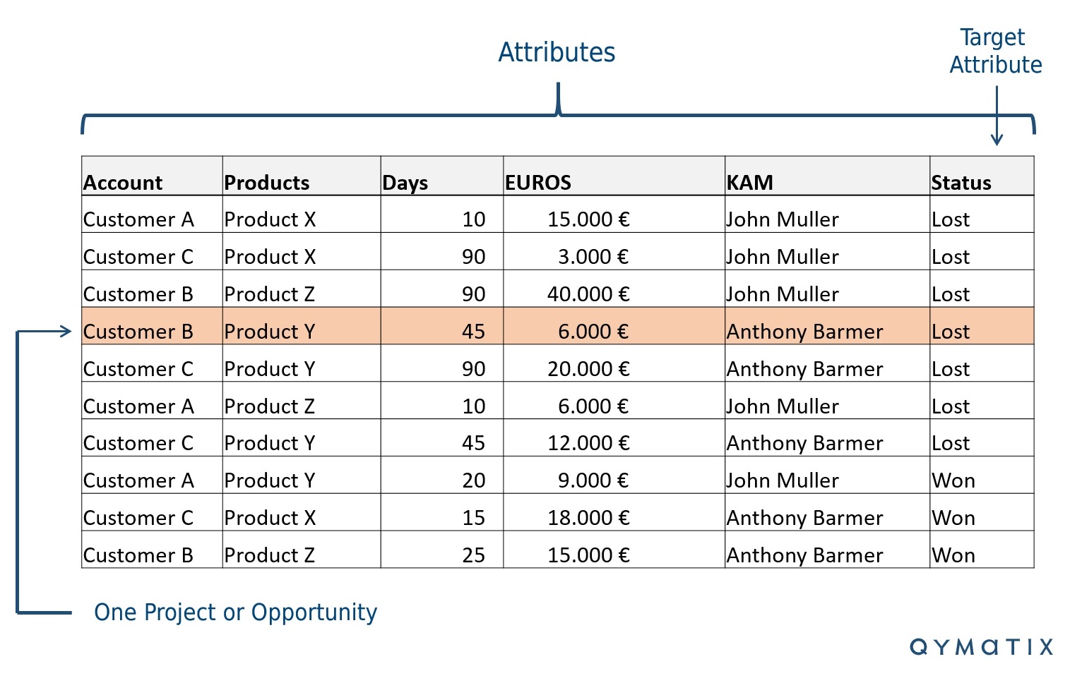
Of course, you probably do not all have the same “attributes” or column names. Use this example only as a guideline.
We define the problem as “supervised ” because we want to predict a target attribute. It is a classification problem (rather than, for example, a regression) because the target is a category (yes or no / won or lost) instead of a number.
How do you Get Data Analysis in Excel? The First Step, Prepare your Data.
Before we continue with our forecast with Excel, we need to briefly discuss data quality and consistency.
As with any data mining project, take a step to clean up and prepare your data. Looking back at the excel example above, your job as a manager is to make sure that your sales team fill all cells consistently.
This step involves making assumptions and finding compromises. You can even decide to omit the opportunities that are outside of a “normal” range from the analysis. Think of these as “outliers” or unreliable data.
For the type of predictive analytics method that we are discussing here, make sure you divide all attributes into classes or groups. You must first classify numerical characteristics.
For example, again using our image above, the attribute “days” (how old an opportunity is) and “Euros” (the sales potential or your sales goal for this lead) are numerical. Convert them into classes.
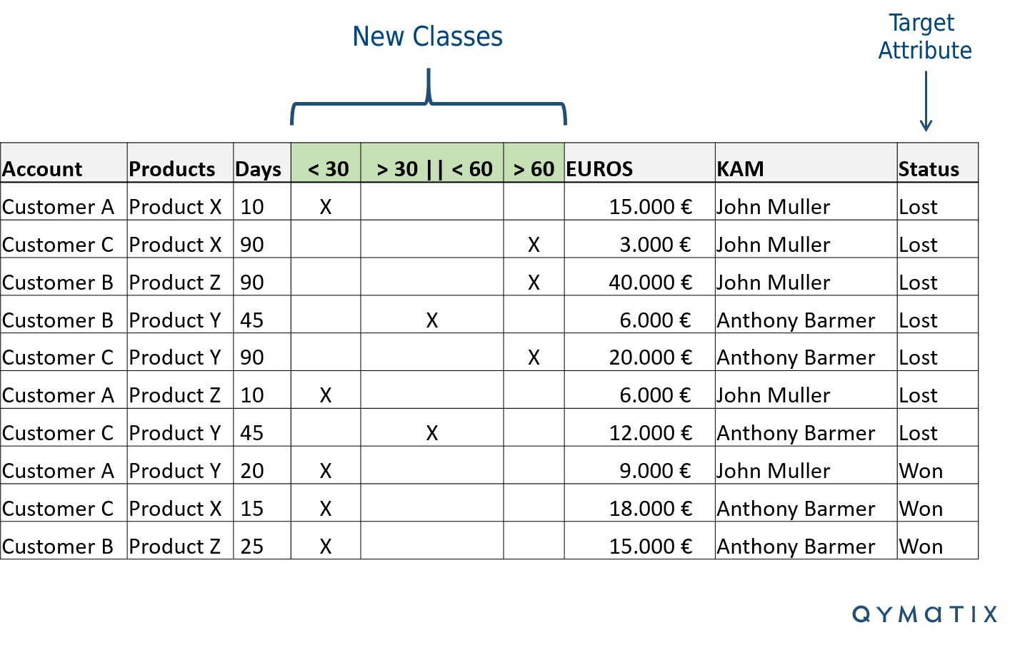
You will only classify the attributes you are trying to predict – to know how much information they offer. A simple method is to split the ranges into three or four groups. For example, in the case of the lifecycle, you can group sales plans that are less than 30 days old, between 30 and 60 days, and those older than 60 days. Each opportunity should belong to one class only. Avoid too many classes – three to four will do it. Otherwise, you will be “overfitting” your model.
Going back to our Excel example, add new columns for each class, as shown in the following figure.
Data Mining Techniques for Sales: Leads and Opportunities Scoring.
We now have a typical classification problem. We have defined a target attribute (Status – opportunity won or lost) and various informative ones. We have cleaned and structured our data. We have created new informative classes for numerical attributes, such as Lifetime or duration for each sales lead.
Our fundamental question is now: which of these informative attributes or properties is best suited to segment our pipeline so that we can predict successful leads from hopeless ones?
For classification problems, we can answer a question by creating a predictive analytics formula.
Fortunately, in classification problems, we can answer this question by creating a formula. This algorithm evaluates how well each attribute segments our pipeline concerning our selected target variable.
Now we introduce an essential data mining concept: entropy. Entropy is a measure of the disorder (or impurity) per attribute of a given dataset. Similarly, entropy is a measure of the mean information gain (more about it later) per characteristic of a data source that represents a system of information.
Data scientists define the entropy as:
entropy = – p1 log (p1) – p2 log (p2) – …
The log is logarithm based on two. Each p is the relative percentage of the property within the sentence – its probability. In our example, of the ten sales opportunities (leads), three are open for more than 60 days. In this case, the likelihood of a sales lead belonging to this class is 30 % (3/10 = 0.30).
Similarly, for the target attribute, the successful acquisition of actual new business has 30 % chances (3/10 = 0.3). Therefore, the probability that from a sales lead no buyer will result in 70 %. Now, the entropy of our pipeline is:
entropy (pipeline) = – [0.7 x log(0.7) + 0.3 x log(0.3) ]
= – [0.7 x -0.5 + 0.3 x -1.74 ]
= 0.88
What entropy means is not necessarily intuitive. It is only relevant to know that entropy near one represents a more “impure” segmentation and entropy near zero is “purer”. In other words, if you win half of your leads, your pipeline will have a maximum entropy of one. You have a very “uncertain” mix.
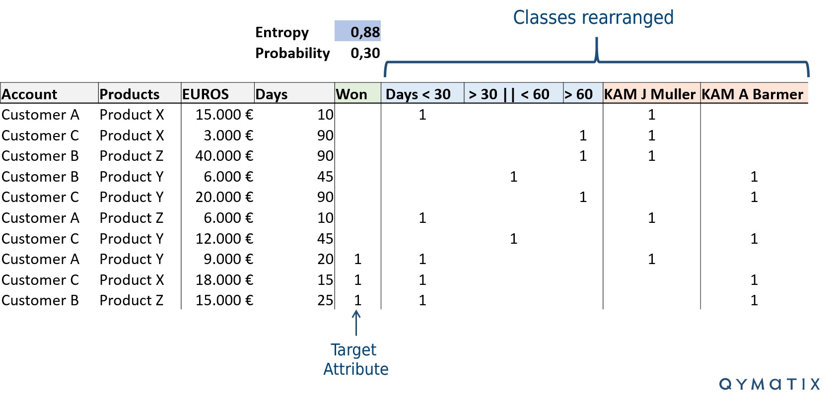
We rearranged our excel a bit using classes. We put the number “1” instead of the “X” to make the computation easier. Finally, we added the probability and the entropy of the target attribute. You can calculate the logarithm base two using the function LOG in excel. Look at the image below.
One Predictive Analytics Example Applied to your Sales Planning? The Information Gain Tool.
Entropy is only part of the story. We would like to know how informative an attribute is, concerning our goal – its information “gain”. In other words, what is a better predictor of sales success? For example, who is the Key Account Manager or how old the opportunity is?
The entropy measures how “disordered” a dataset is. What we need is information. In information theory, data scientists also refer to information as a measure of eliminated uncertainty (Wikipedia).
The information gain (IG) measures how much an attribute improves (reduces) the entropy over the entire new segmentation that it generates.
[bctt tweet=”How to discover the properties that provide more information about a sales opportunity? Using Predictive Analytics”]
Now comes the interesting fact. Looking back at the image above, you will notice the two rearranged classes: days and KAMs. We use these classes to calculate how much information we gain with each attribute.
In the context of our supervised segmentation of sales opportunities, we split the entire group using – for example – days and KAMs.
We calculate the information gain of each attribute by subtracting the weighted entropy of the selected attribute to the entropy of the entire pipeline.
Let’s make an example using the category “days”. Keep in mind that for this attribute we have three subgroups, written as d1, d2 and d3.
IG (pipeline, attribute) = entropy (pipeline) – [p(d1) x entropy (d1) + p(d2) x entropy (d2) + p(d3) x entropy (d3)]
IG (pipeline, attribute= “days”) = 0.88 – [0.75 x 0.81 + 0.33 x 0.92 + 0.0 x 0.0]
IG (pipeline, attribute= “days”) = 0.06
If we repeat this calculation, using now the attribute KAM instead of days, we get an IG:
IG (pipeline, attribute= “KAM”) = 0.24
The Information Gain tells us how important a given attribute is. Consider again our question: which attribute is more informative, the sales plan owner or how long the sales cycle last?
You can now answer “KAMs”. According to our calculation, splitting the entire pipeline by sales reps reduces the uncertainty and adds more information. In this example, it’s better to know who the key account manager is than how old each opportunity is. In predictive analytics terms and for this example, the attribute “KAM” is a better predictor.
Data Mining Techniques to Improve Sales? Let the Machine Learn.
In this example, we used Excel to show that knowing who the responsible salesperson is for a customer gives us more information than the antiquity of the sales opportunity. We have applied segmented supervision, entropy and information gain to classify predictors and attributes.
This data mining method provides valuable information in predicting which sales opportunity a sales manager should push or where they should prioritise. What are the next steps?
Using this data mining method across your CRM or ERP data, you can now determine which attributes are more informative. Concerning predictive analytics modelling, the next step is to create a “decision tree” – a standard machine learning methodology.
A decision tree is a fancy name for a series of subdivisions, using first the attributes with more information. That is, decision trees simply represent decision rules. The graphical representation of a tree diagram illustrates hierarchically successive decisions. A picture speaks a thousand words. Look at the one below.
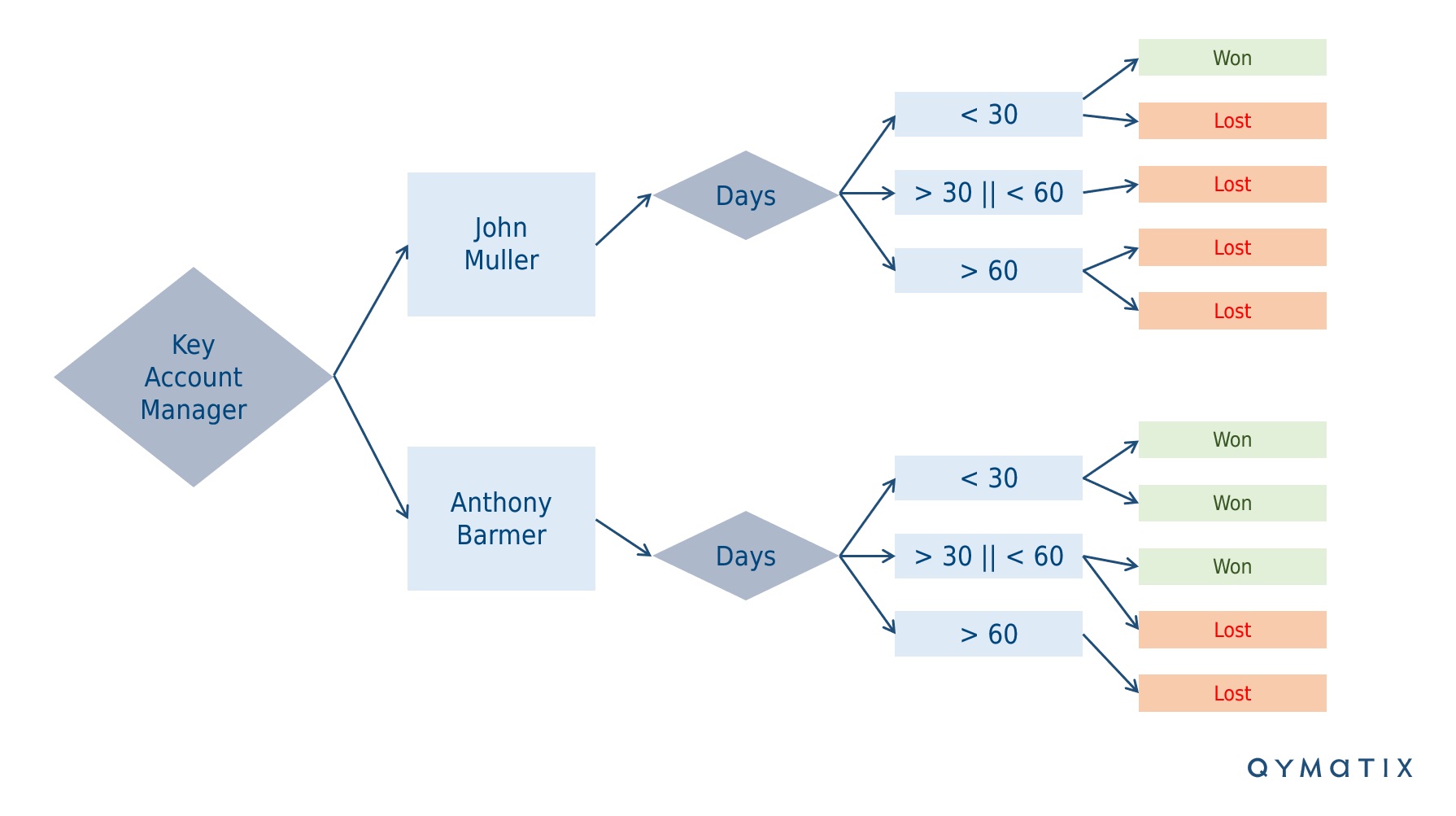
You can use the Information Gain to calculate the ordering of attributes in the nodes of a decision tree.
Finally, consider how to visualise the insights you gained and how to share the calculations with your sales team efficiently.
CALCULATE NOW THE ROI OF QYMATIX PREDICTIVE SALES SOFTWARE
One Useful Example of Predictive Sales Analytics Using Excel – Conclusion:
Predictive analytics, a critical challenge for mid-sized companies, works with a collection of data mining methods used to describe and predict the likelihood of future outcomes.
Excel is a very flexible software for predictive analytics. With some time and basic knowledge of data mining, a sales leader can, for example, successfully prioritise a sales pipeline using Excel. There are, of course, alternatives to Excel for predictive analytics and sales planning.
In this article, we introduced some basic concepts of predictive analytics. First, entropy, used to measure how “pure” or “ordered” an assortment is. Second, Information Gain, which calculates the amount of information that each attribute gives – in statistical terms. The higher the IG, the more information an attribute provides.
Using the more informative attributes, a sales manager can prioritise the sales leads with better chances of closing, dynamically adjust prices, or avoid customer churn.
I want to see what how Predictive Analytics with Excel can work for me.
Free eBook for download: How To Get Started With Predictive Sales Analytics – Methods, data and practical ideas
Predictive analytics is the technology that enables a look into the future. What data do you need? How do you get started with predictive analytics? What methods can you use?
Download the free eBook now.
- We will use this data only to contact you for discussing predictive sales KPIs. You can read here our declaration on data protection.
Further Read:
Data Science For Business: What You Need to Know About Data Mining & Data-Analytic Thinking, by F. Provost & T. Fawcett
Header Image: Johann Heinrich Wilhelm Tischbein [Public domain], via Wikimedia Commons

